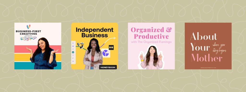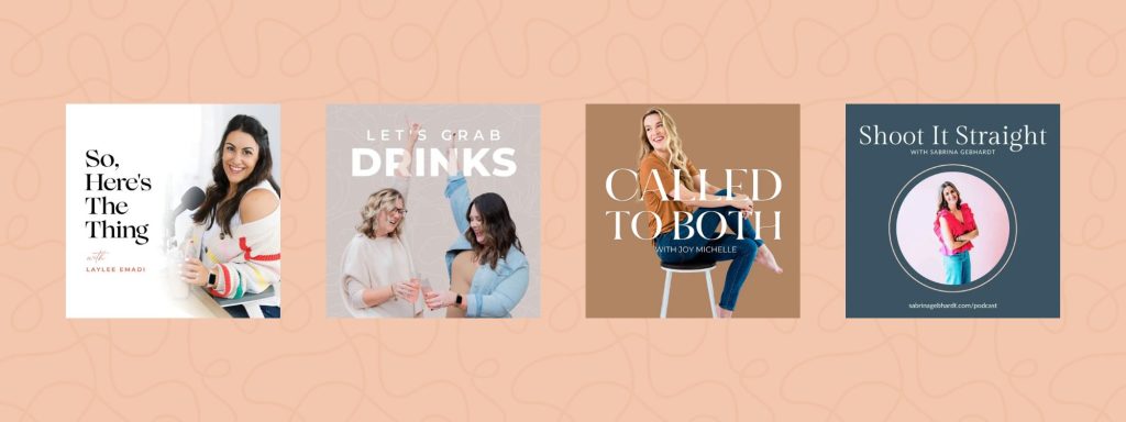
When it comes to launching a podcast, your cover art is often the first impression potential listeners get. Whether they’re scrolling through their podcast app or spotting your show on social media, eye-catching and professional cover art can make all the difference in grabbing attention.
But what makes podcast cover art effective? It’s not just about being visually appealing—it needs to communicate your podcast’s identity clearly and quickly. Here are three essential features that will help your podcast cover art stand out.
3 Features that Make for Great Podcast Cover Art
1. Your Podcast Title & Host Name
Your cover art should immediately tell listeners what your podcast is about and who’s behind the mic. Including your podcast title in a clear, readable font is non-negotiable. If your podcast is hosted by you (and you’re building a personal brand), consider adding your name as well.
Why it matters:
- Brand recognition: Your name builds familiarity and authority, especially if you have an existing audience.
- Clarity: New listeners can instantly identify the podcast topic and host, making it easy to remember and recommend.
💡 Design Tip:
- Use large, legible fonts—even at smaller sizes. Many people browse podcasts on their phones, so your text should be readable in thumbnail view.
- Stick to two fonts max to keep the design clean and professional.

2. A Pop of Color
Color plays a major role in grabbing attention. Bright, bold, or contrasting colors make your podcast cover art stand out against a sea of muted or monochromatic designs.
Why it matters:
- Visual contrast: Bold colors catch the eye and make your podcast easier to spot.
- Emotional connection: Colors evoke feelings and set the tone for your show. For example:
- Yellow → Energetic, optimistic, and creative
- Blue → Trustworthy, calm, and professional
- Purple → Creative, luxurious, and mysterious.
- Red → Bold, passionate, and powerful
- Pink → Playful, creative, and feminine.
- Black → Sophisticated, powerful, and sleek.
💡 Design Tip:
- Choose one or two accent colors that reflect your podcast’s vibe.
- Use contrasting shades for text and background to ensure readability.

Note: When selecting your imagery, make sure it’s unique and custom to you—avoid stock imagery at all costs.
3. Minimal & Simplistic
When it comes to cover art, less is more. Overly complex designs can look cluttered and unprofessional, especially when scaled down. Clean, minimalist designs with plenty of white space are more visually appealing and easier to recognize.
Why it matters:
- Instant recognition: Simple, bold graphics are easier to remember.
- Professionalism: Sleek, uncluttered designs convey credibility.
- Scalability: Your cover art will look sharp on all platforms, from large displays to small thumbnails.
💡 Design Tip:
- Avoid using too many visual elements—one focal image or icon is often enough.
- Use negative space strategically to create breathing room around text and graphics.

Bonus Tips for High-Quality Podcast Cover Art
- Use high-resolution images: Your cover art should be 3000 x 3000 pixels for optimal quality across platforms.
- Follow platform guidelines: Apple Podcasts, Spotify, and others have specific cover art requirements—make sure yours meets them.
- Test the thumbnail view: Before finalizing your design, shrink it down to see how it looks in smaller sizes.
Your podcast cover art is more than just a visual—it’s a branding tool that reflects your show’s identity. By incorporating a clear title, bold colors, and a minimalist design, you’ll create impactful and attractive cover art that grabs attention and draws in new listeners.
If you’re launching or refreshing your podcast, investing time in your cover art design is well worth the effort. A striking visual will not only make your show look more professional but also help you stand out in the increasingly crowded podcast space.


